Project Reveal - Corso Italia
Project Reveal: Corso Italia Transformation
Every once in a while, you encounter a project where everything aligns so perfectly that you can't imagine it any other way. That's precisely what happened with the Corso Italia transformation. From the first meeting with our clients, Shanna and Kevin, we could feel the excitement and shared vision for their home renovation. This blog post explores how we reimagined their space to create a harmonious, functional, and aesthetically pleasing environment for their family of four, plus two cats.
The Starting Point
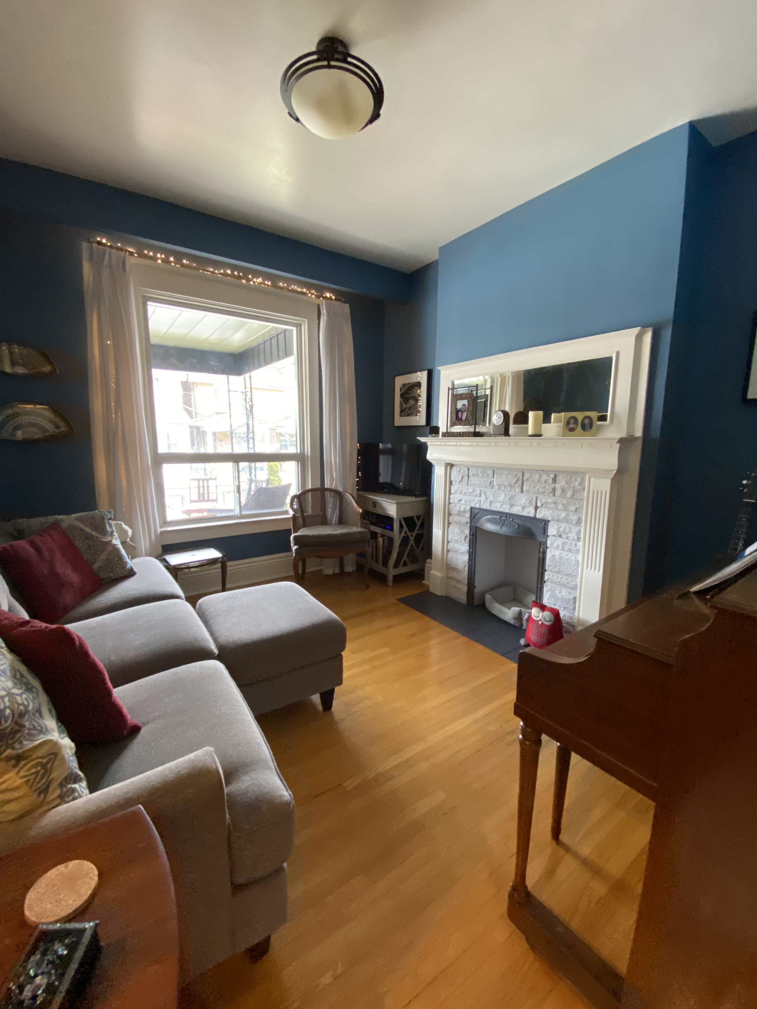
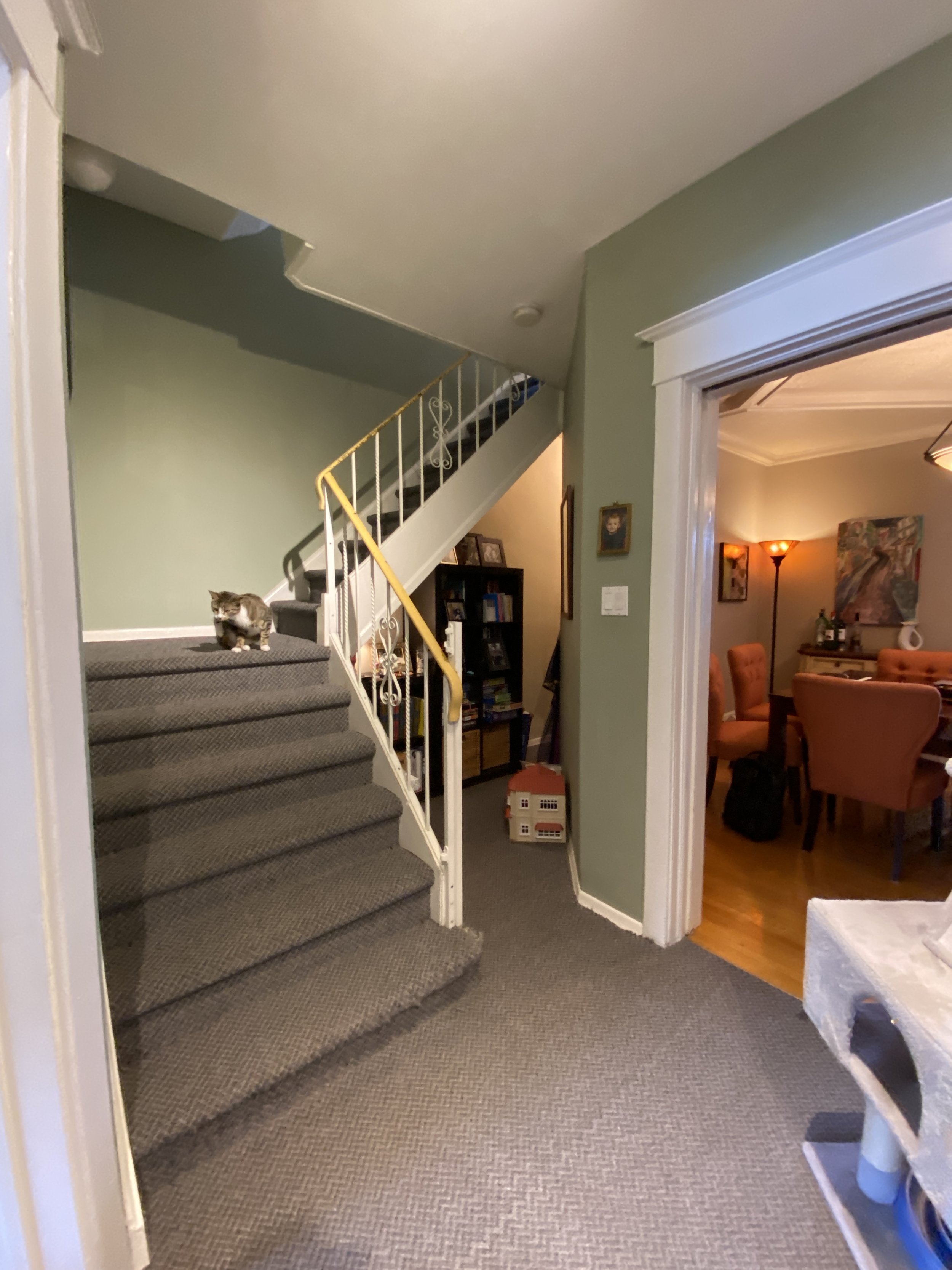
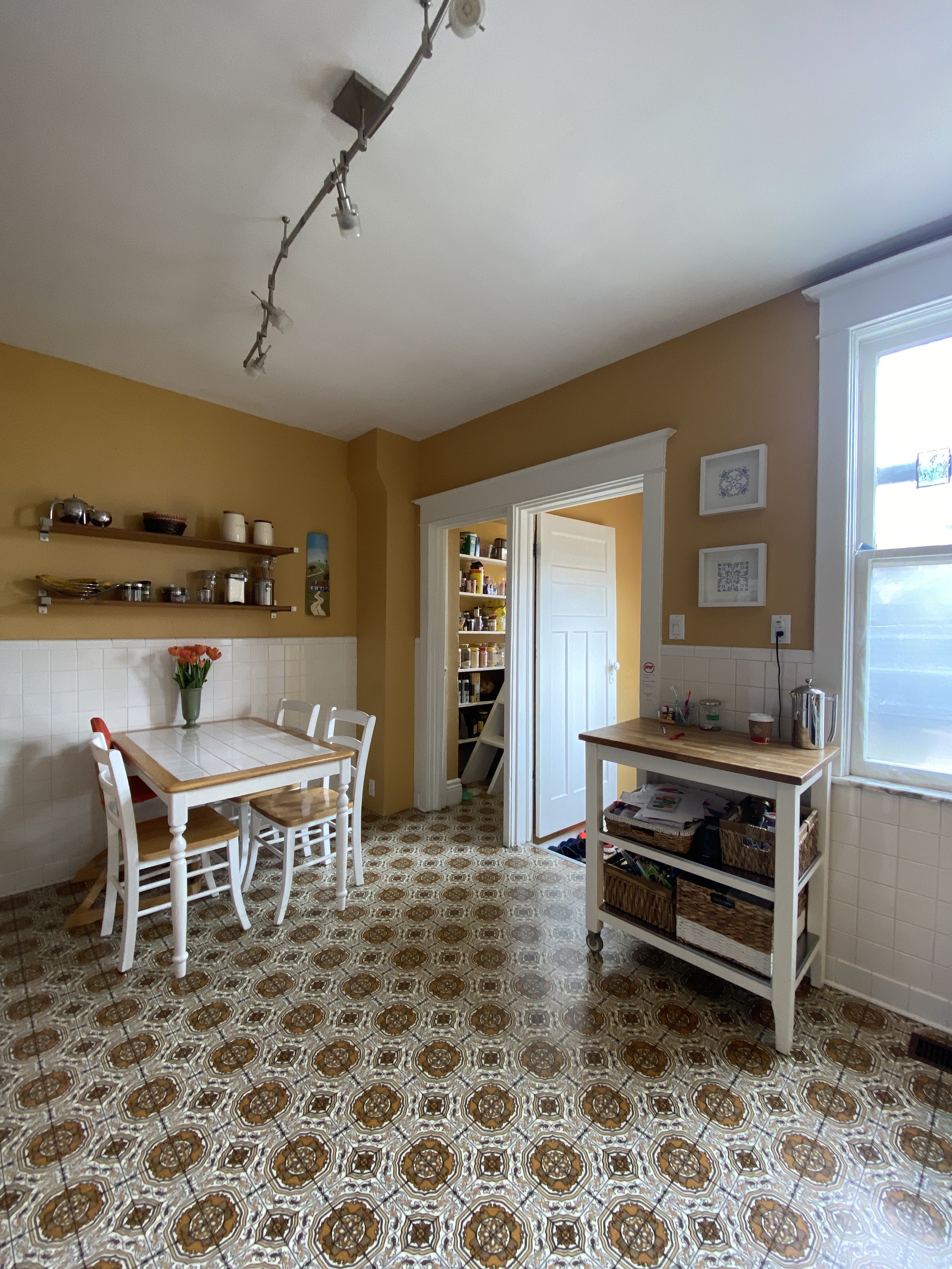
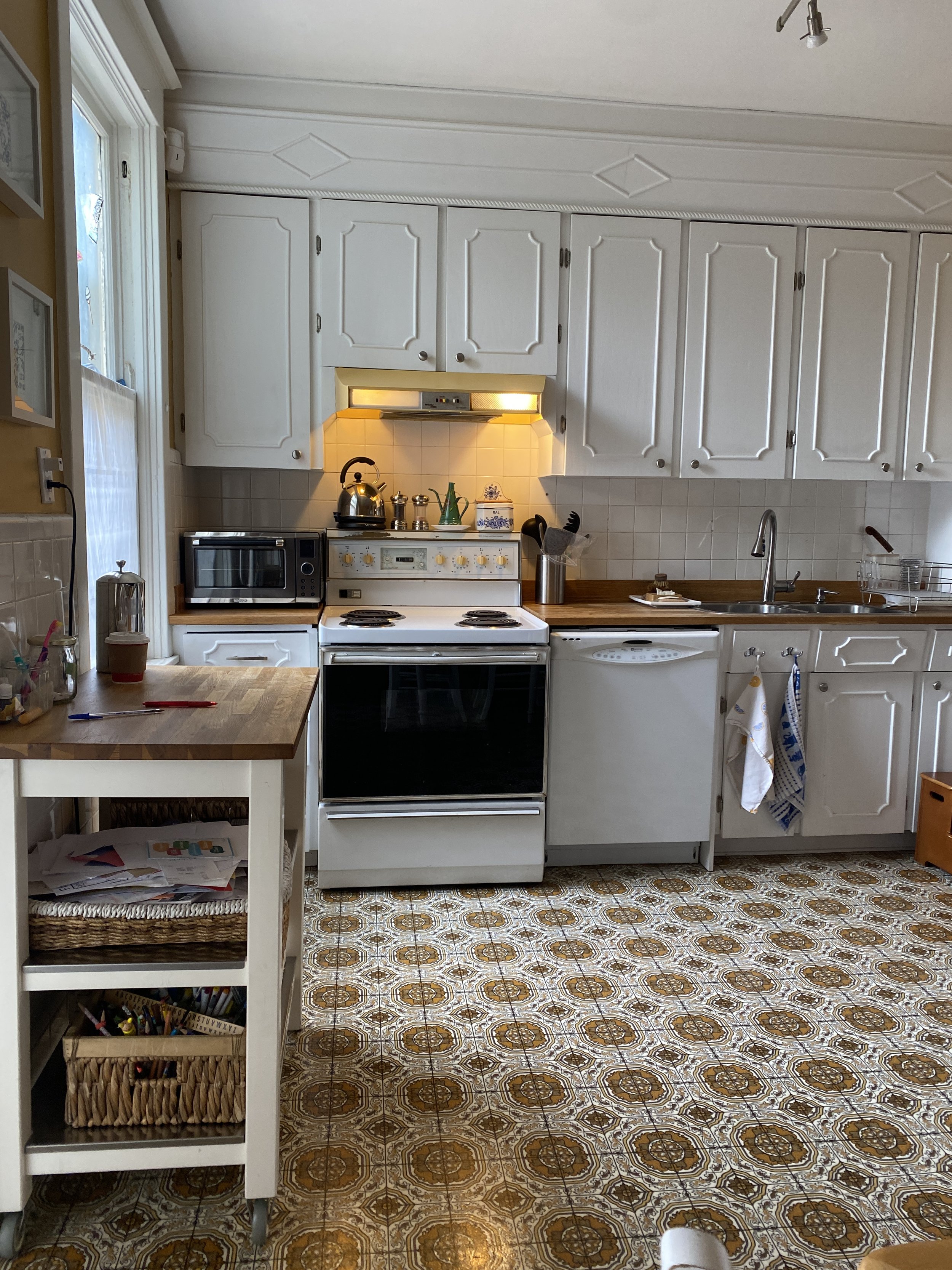
During our initial walk-through, it was clear that the house needed a layout overhaul. The main floor felt closed off, limiting the family's ability to enjoy the space together and making entertaining a challenge. Storage was virtually non-existent, and with two growing kids, the need for more space and functionality was pressing. Our mission was to transform this cramped layout into a welcoming, open, and efficient space for the whole family.
A Design with Heart
Our design approach was inspired by our client’s love for their neighborhood, their appreciation for art and entertaining, their passion for coffee, and their eco-conscious lifestyle. We also took into account their Portuguese heritage, which added a unique flavor to the design. Our goal was to incorporate these elements into a cohesive design that reflected their personality and met their functional needs.
A Refreshing Transformation
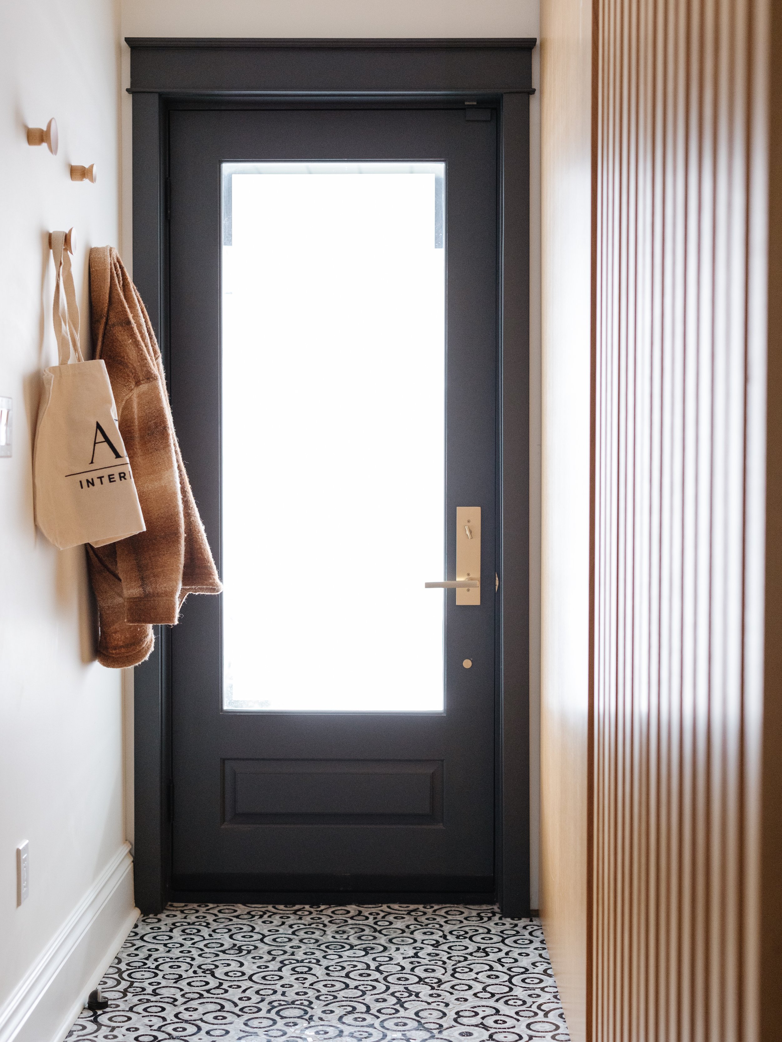
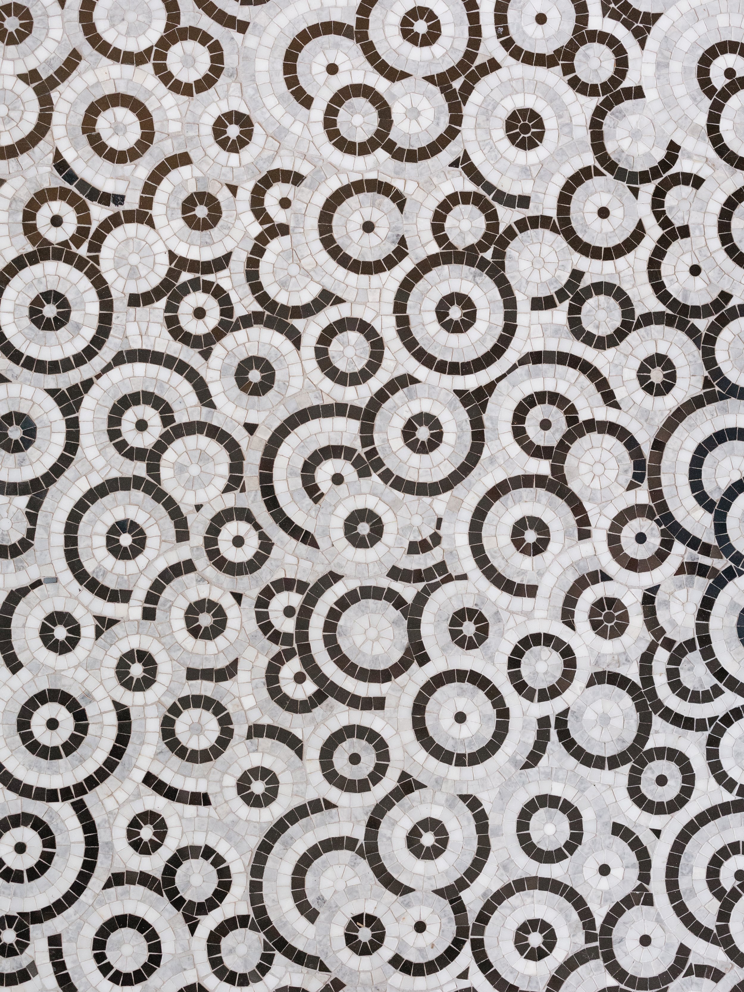
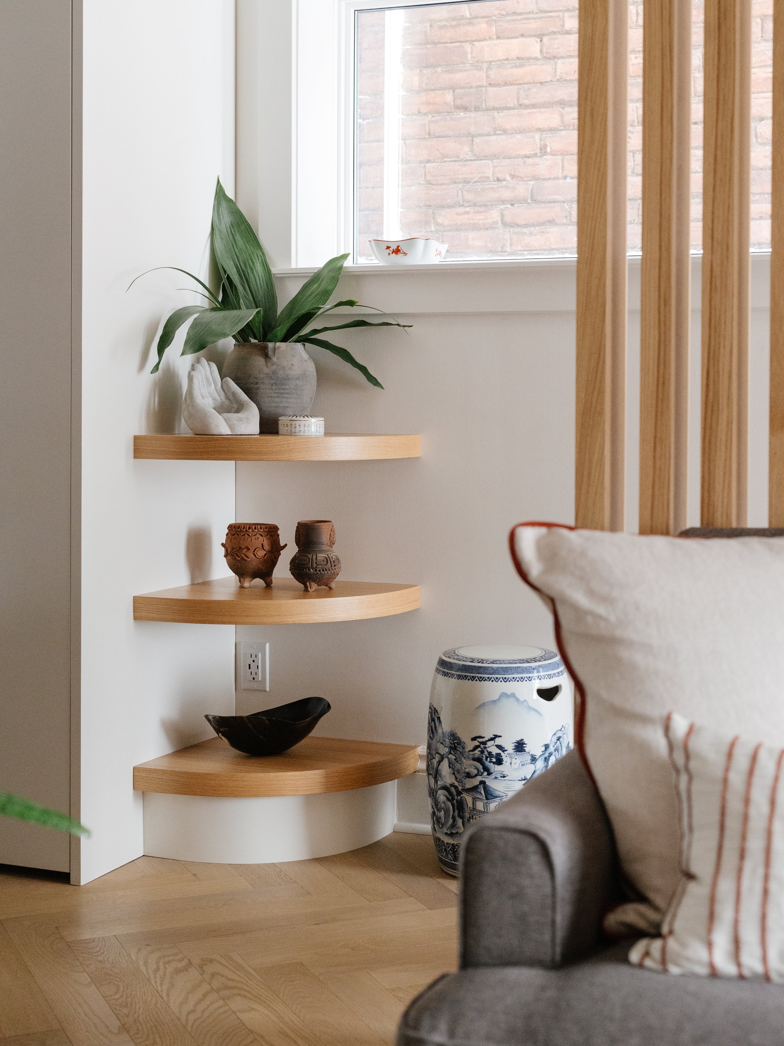
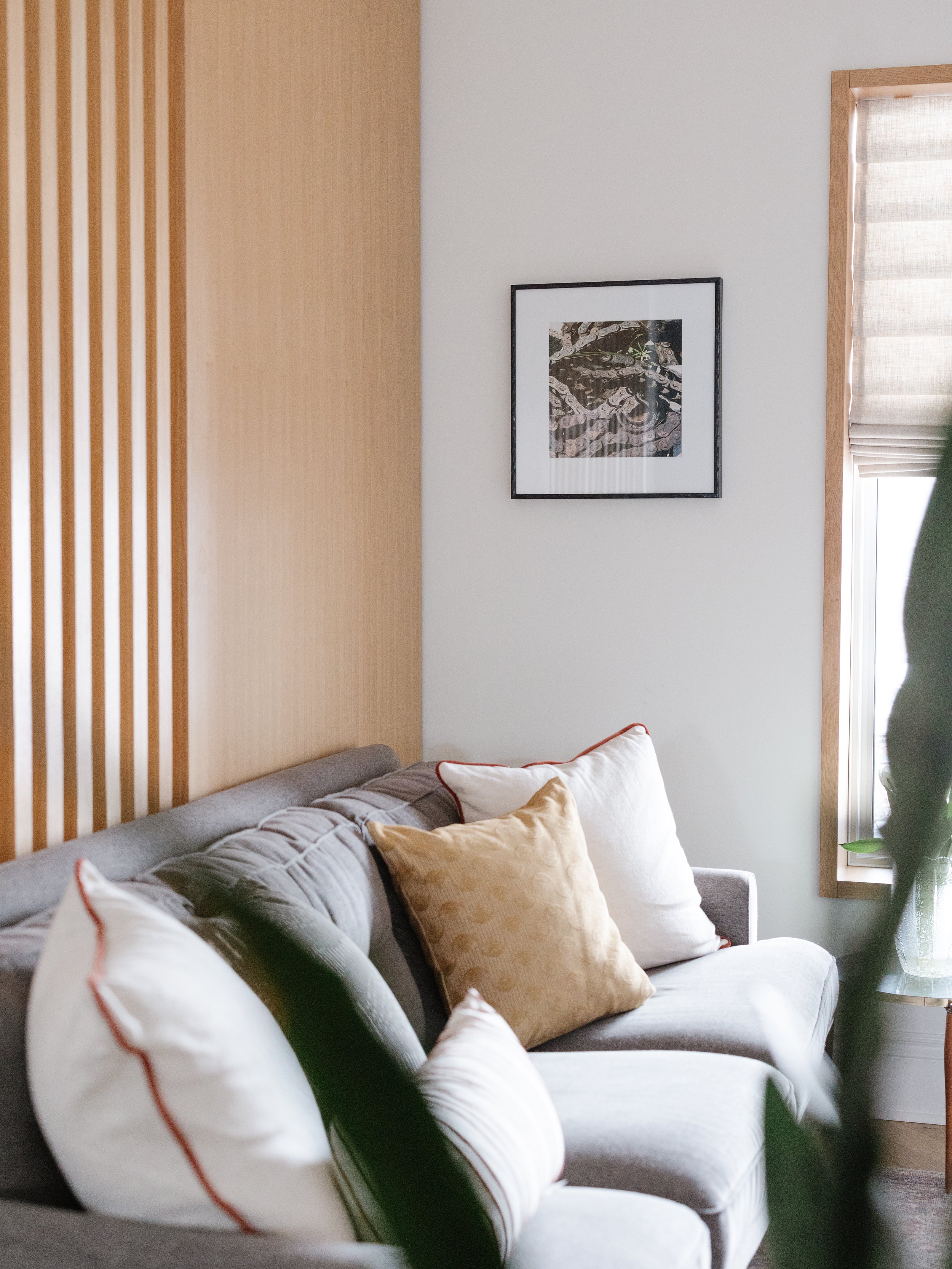
We implemented several key design elements to address the lack of storage and cramped layout. The closed-off main floor was opened up, allowing for better flow and connection between rooms. We chose white oak herringbone flooring, adding a touch of elegance throughout the space. The playful mosaic entryway, made of marble, added a unique touch that set the tone for the rest of the design.
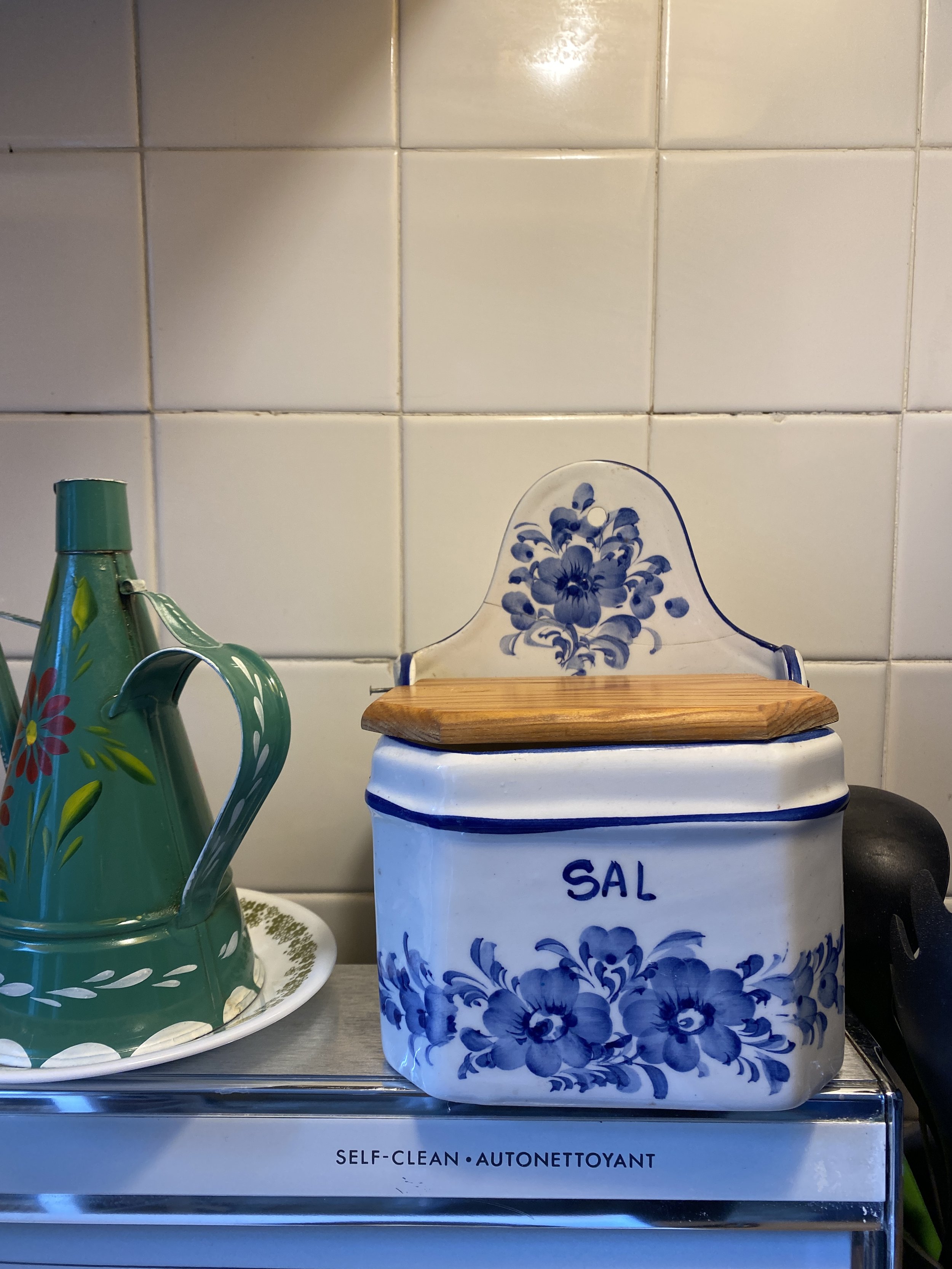
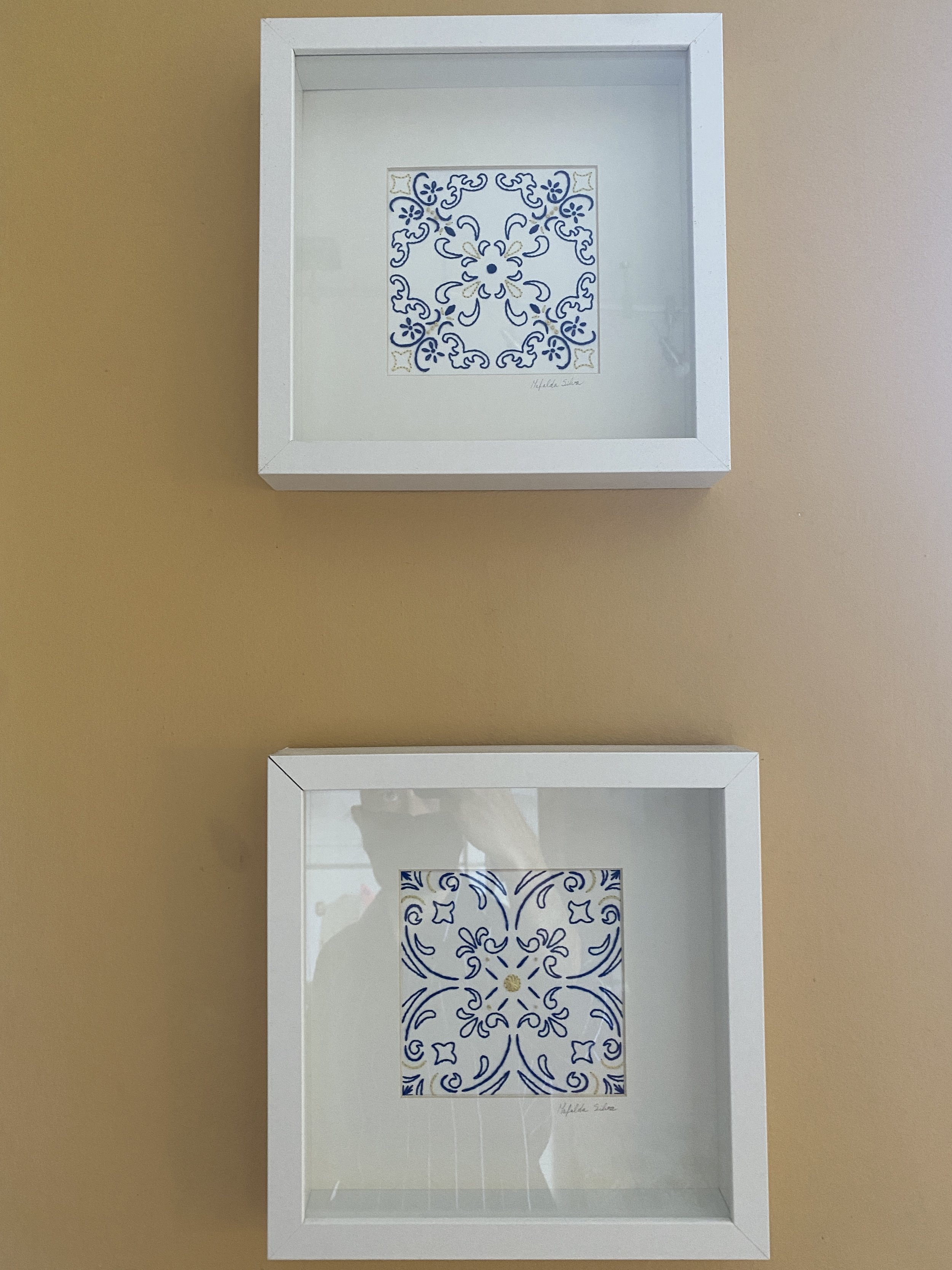
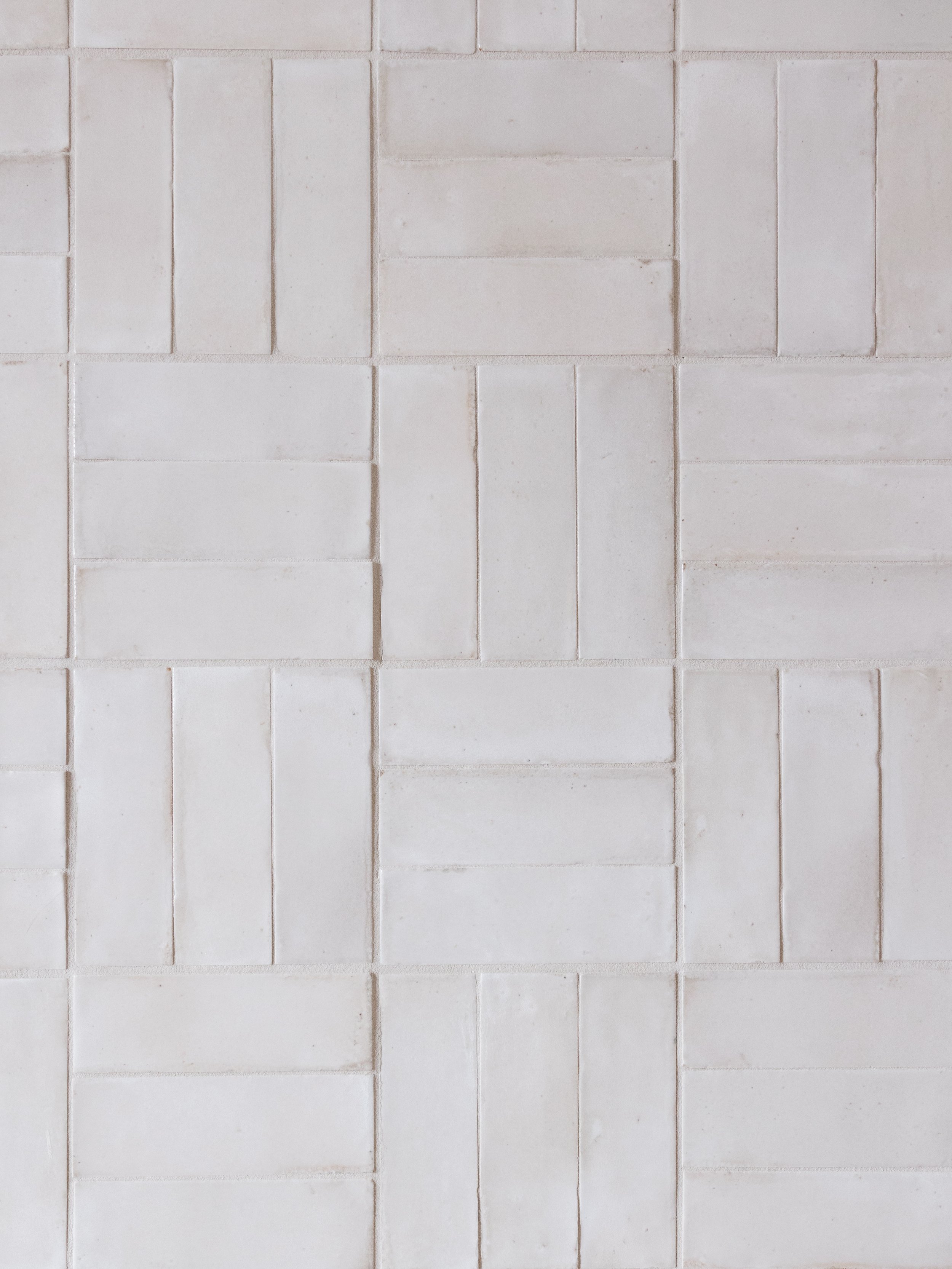
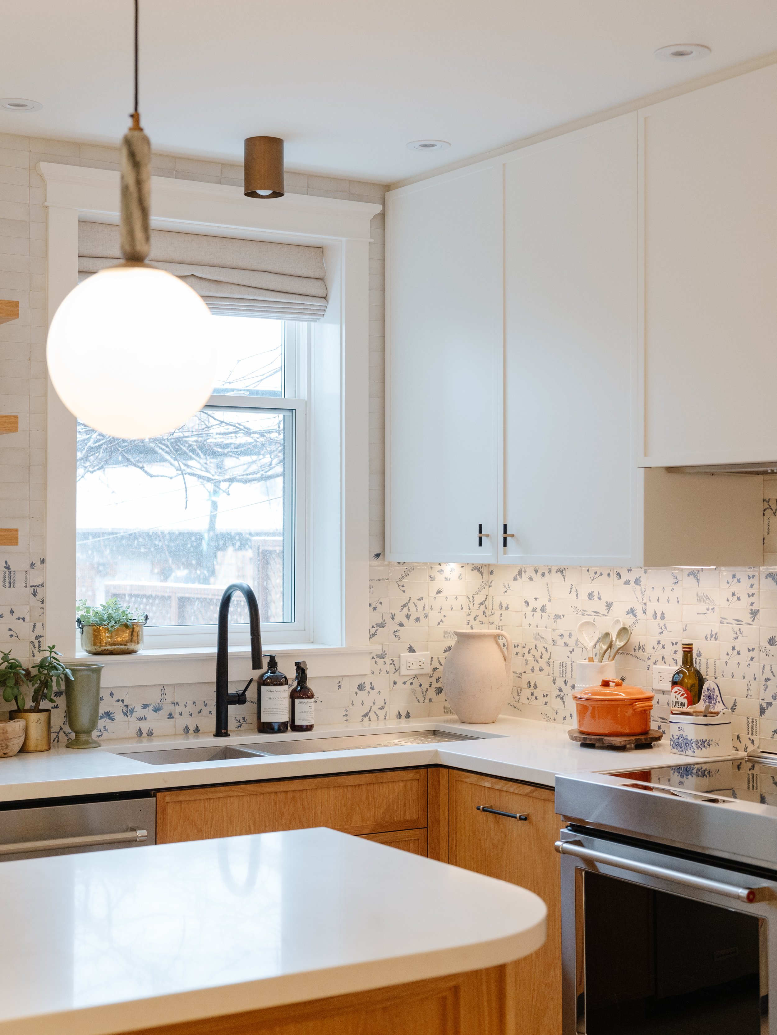
In the kitchen, we installed porcelain flooring for durability and easy maintenance. To infuse a sense of heritage, we used a stunning collection of blue + white tiles as a focal point on the kitchen walls, inspired by the client’s own framed, hand-painted azulejo tiles. These tiles, along with the custom metal and glass sliding doors, created a seamless transition between the kitchen and the rest of the main floor, providing both functionality and style.
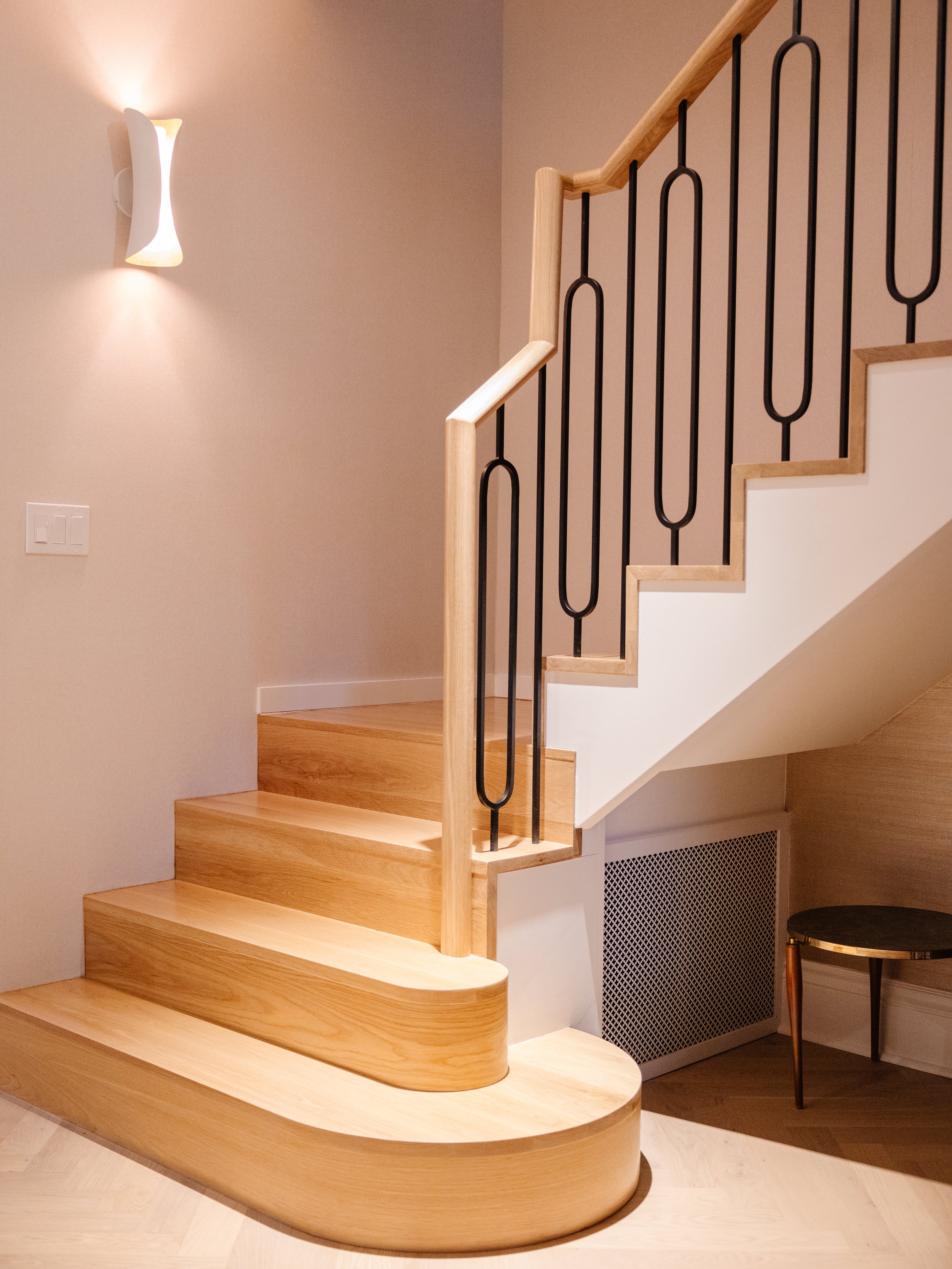
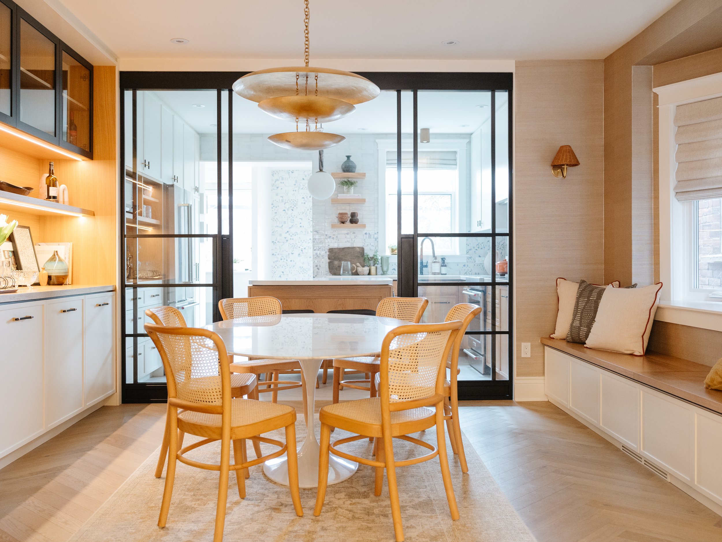
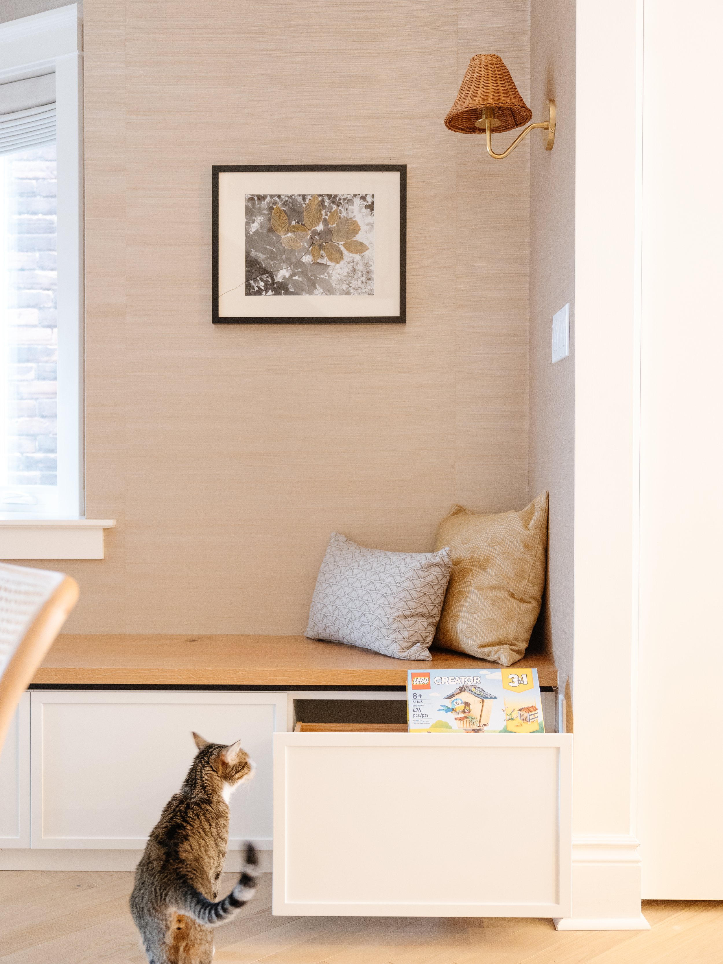
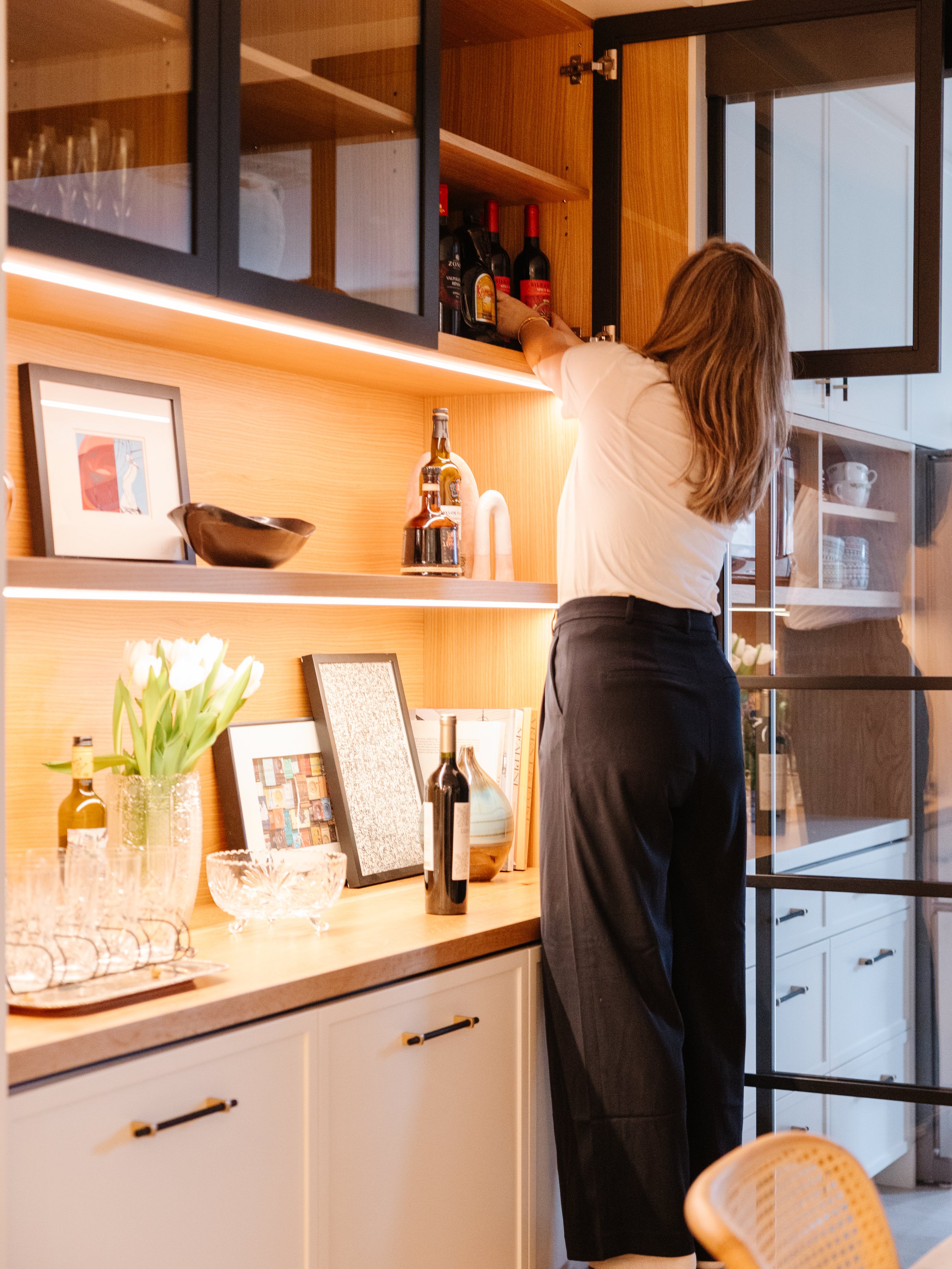
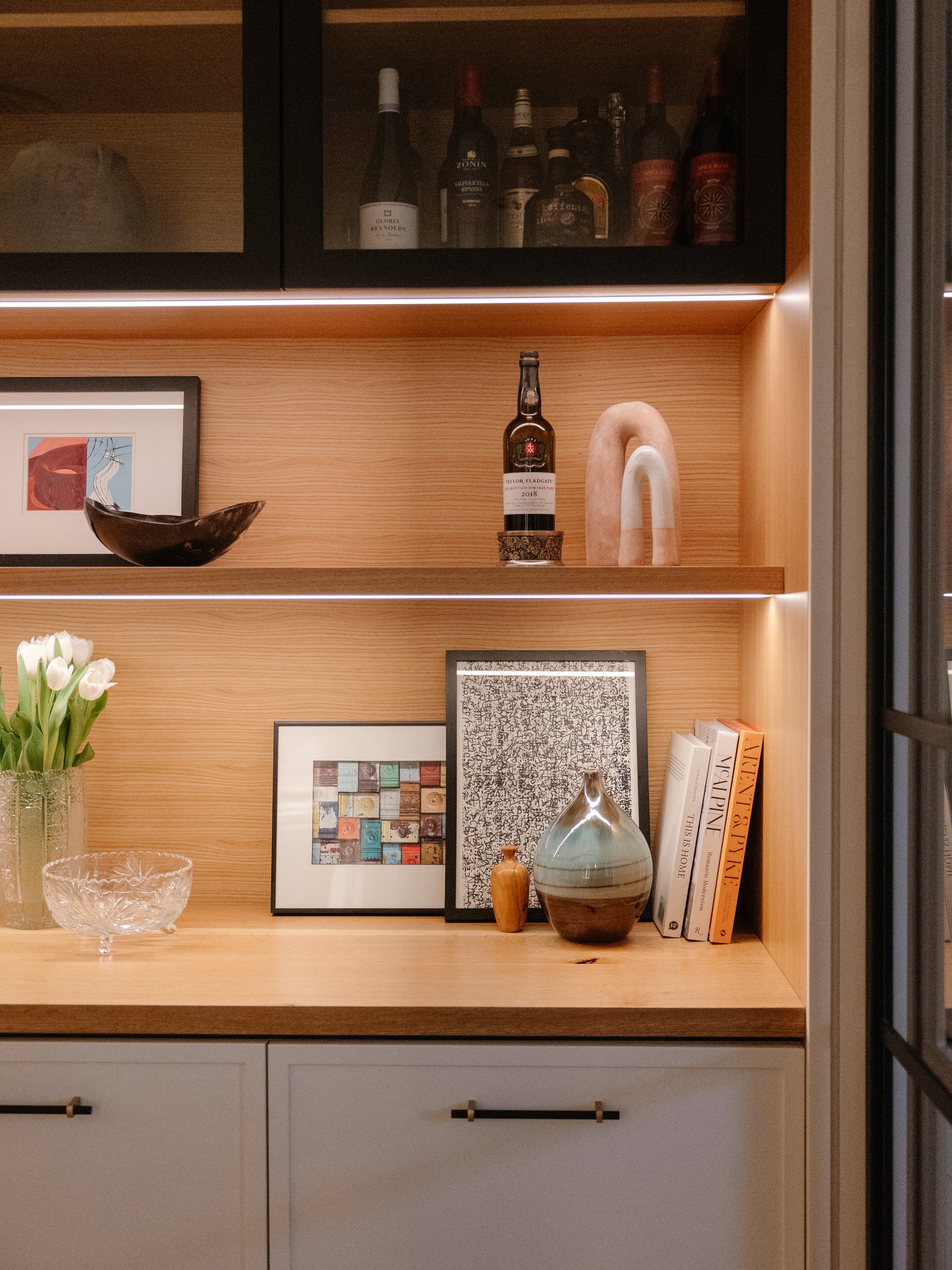
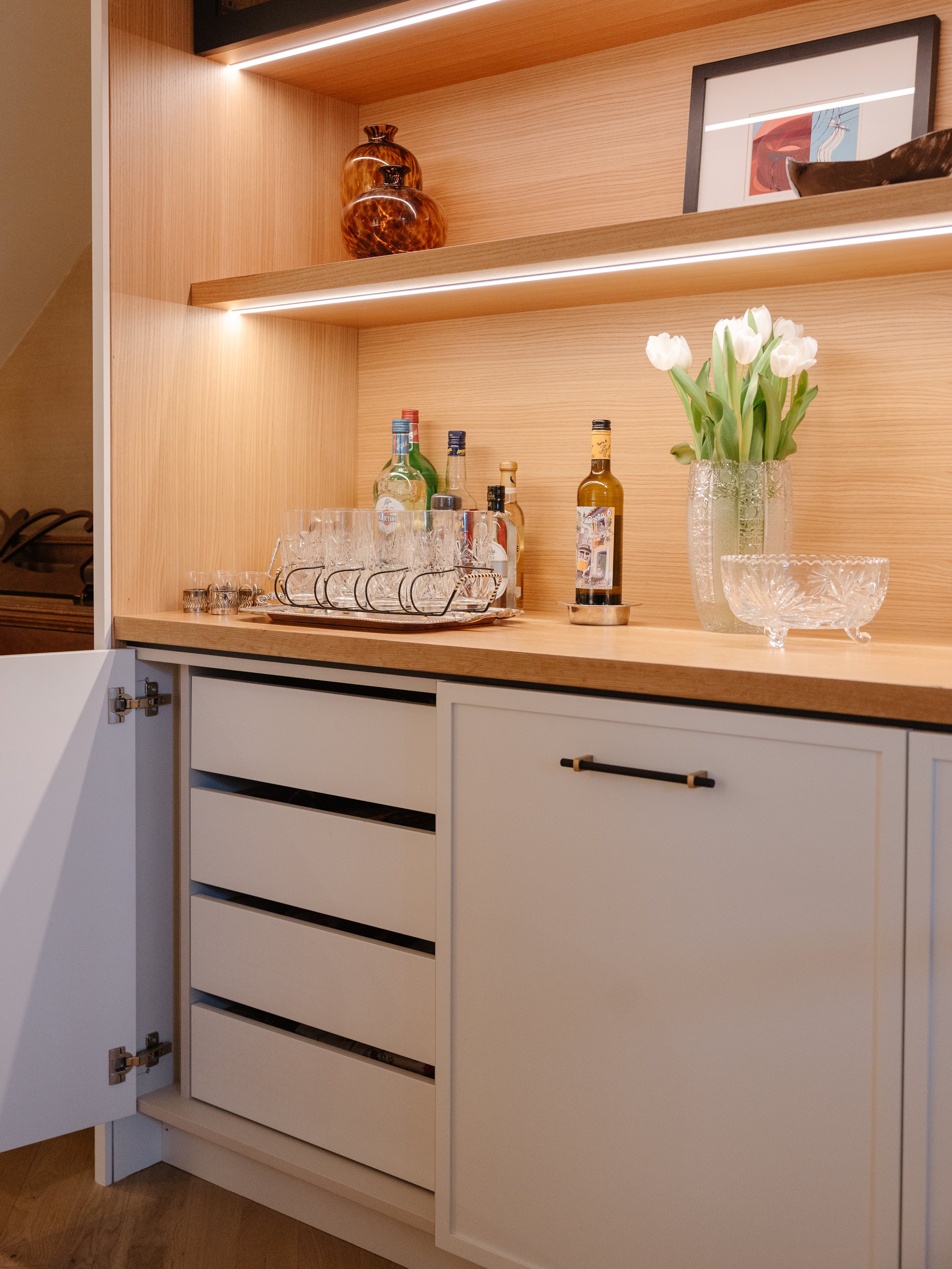
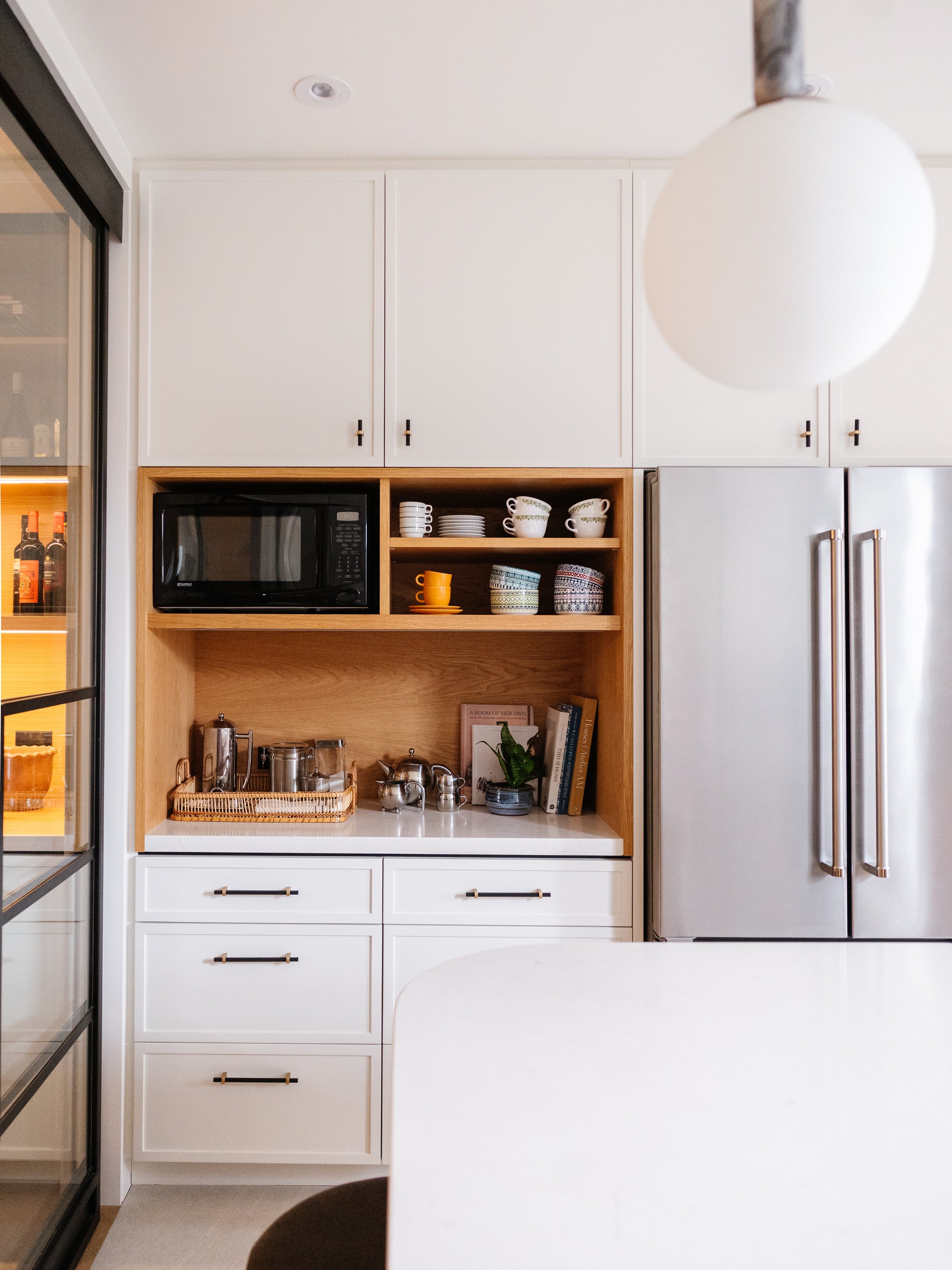
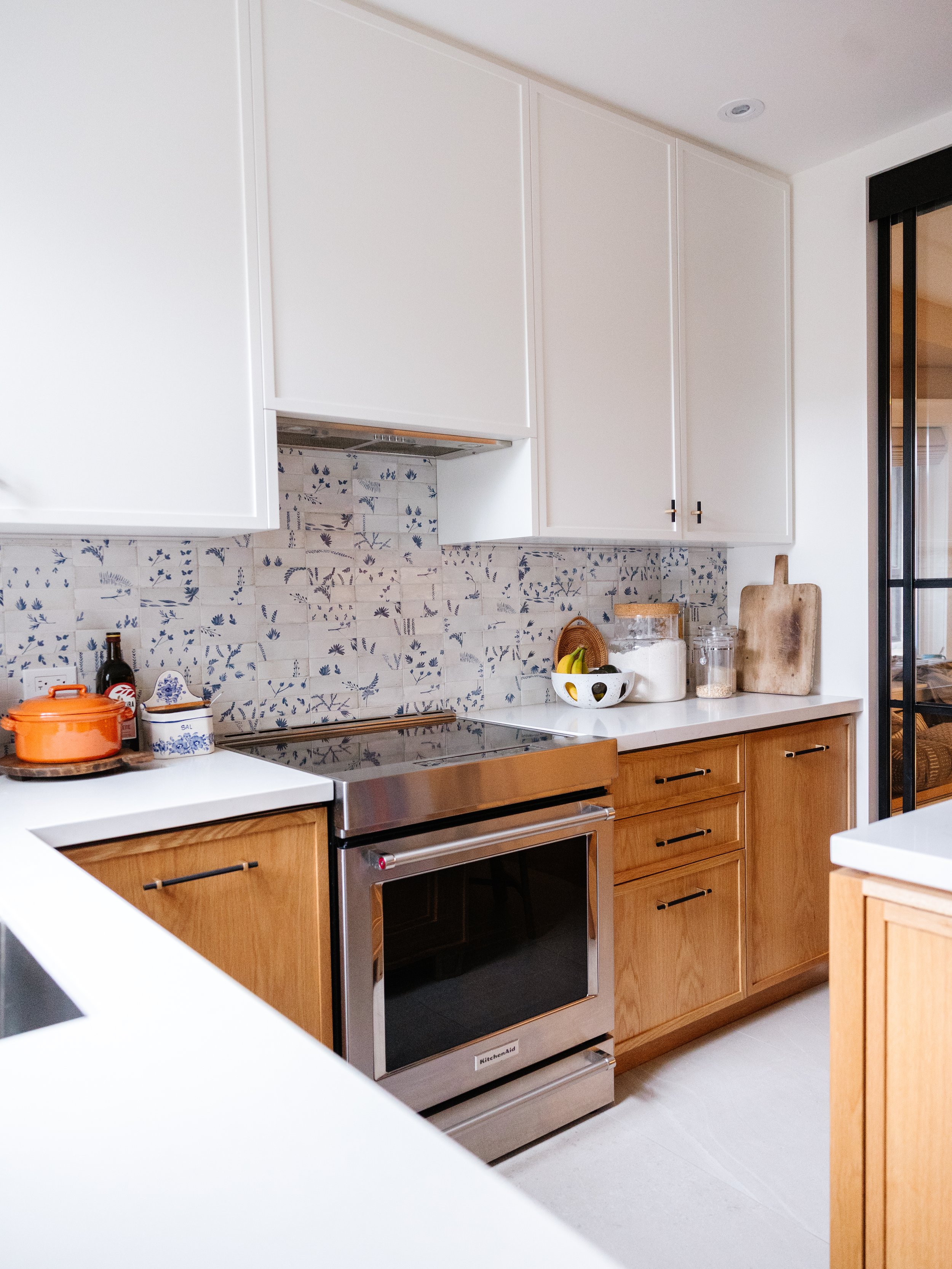
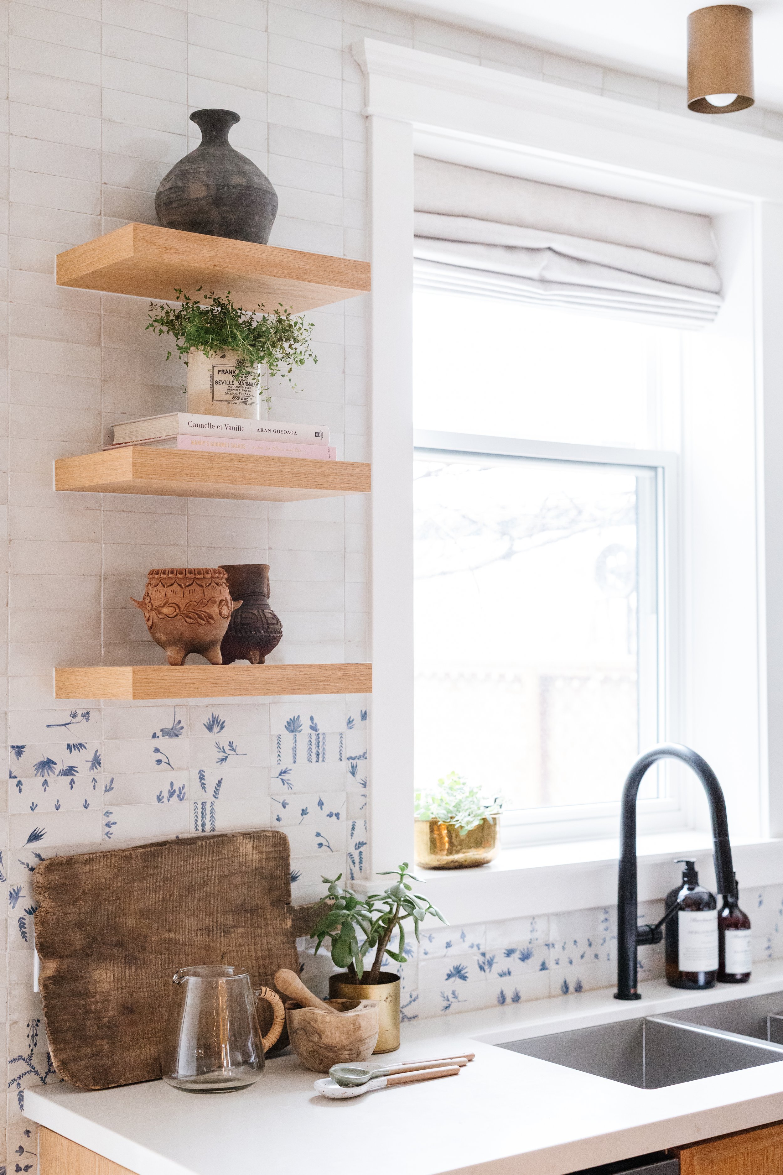
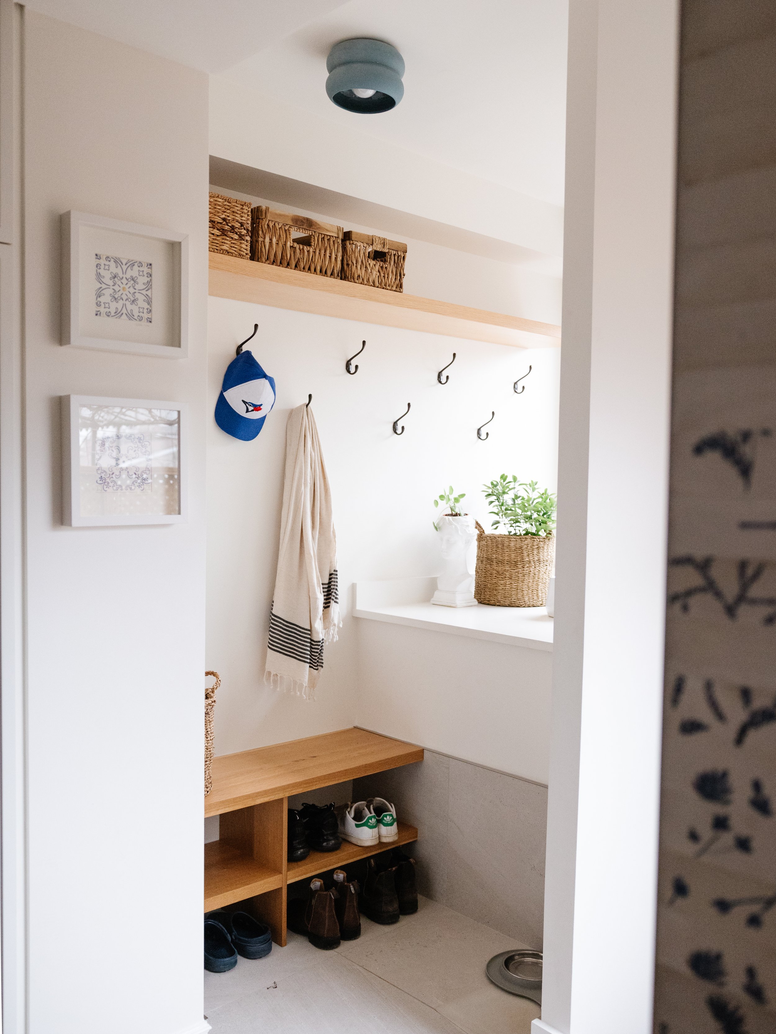
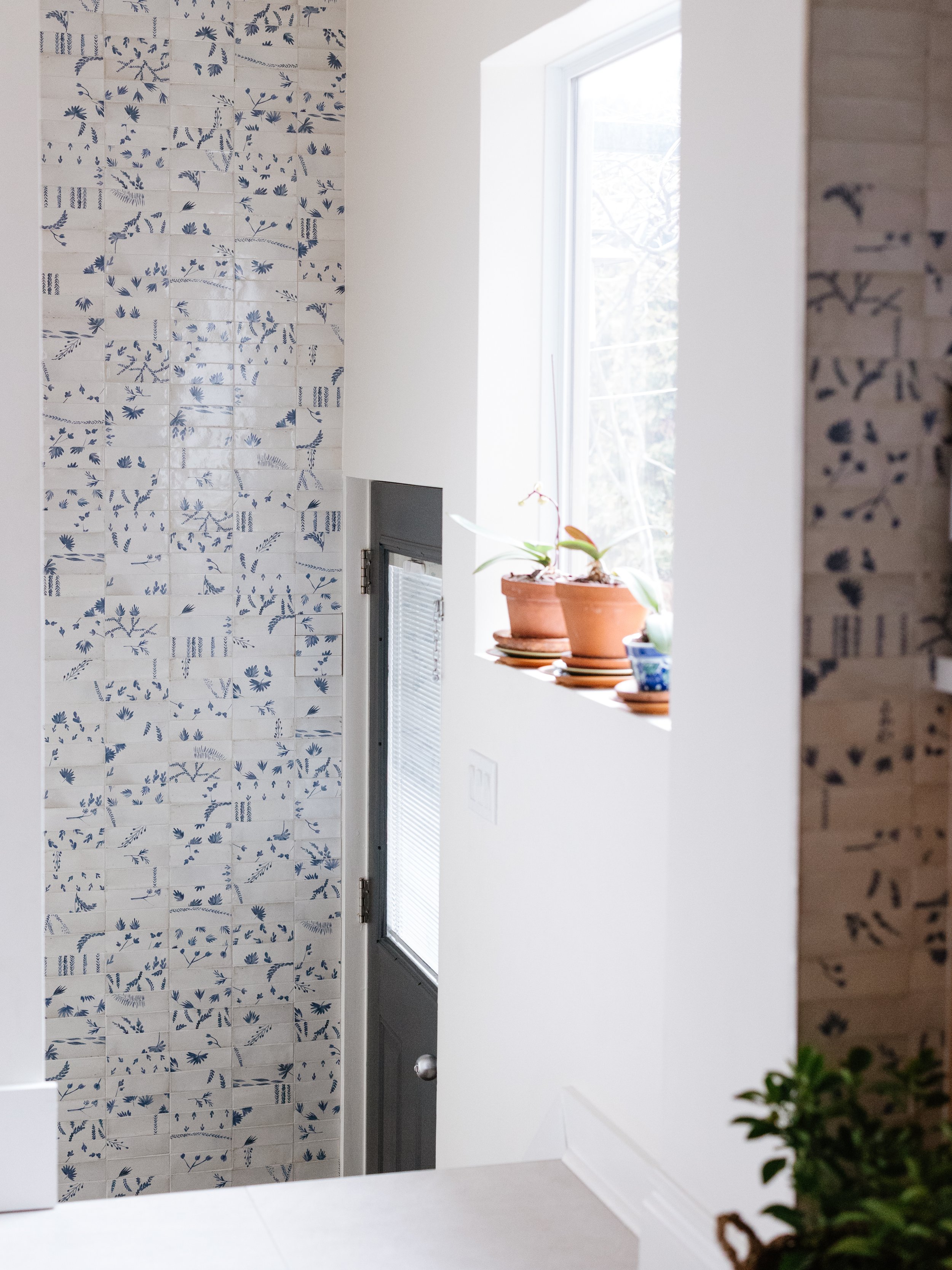
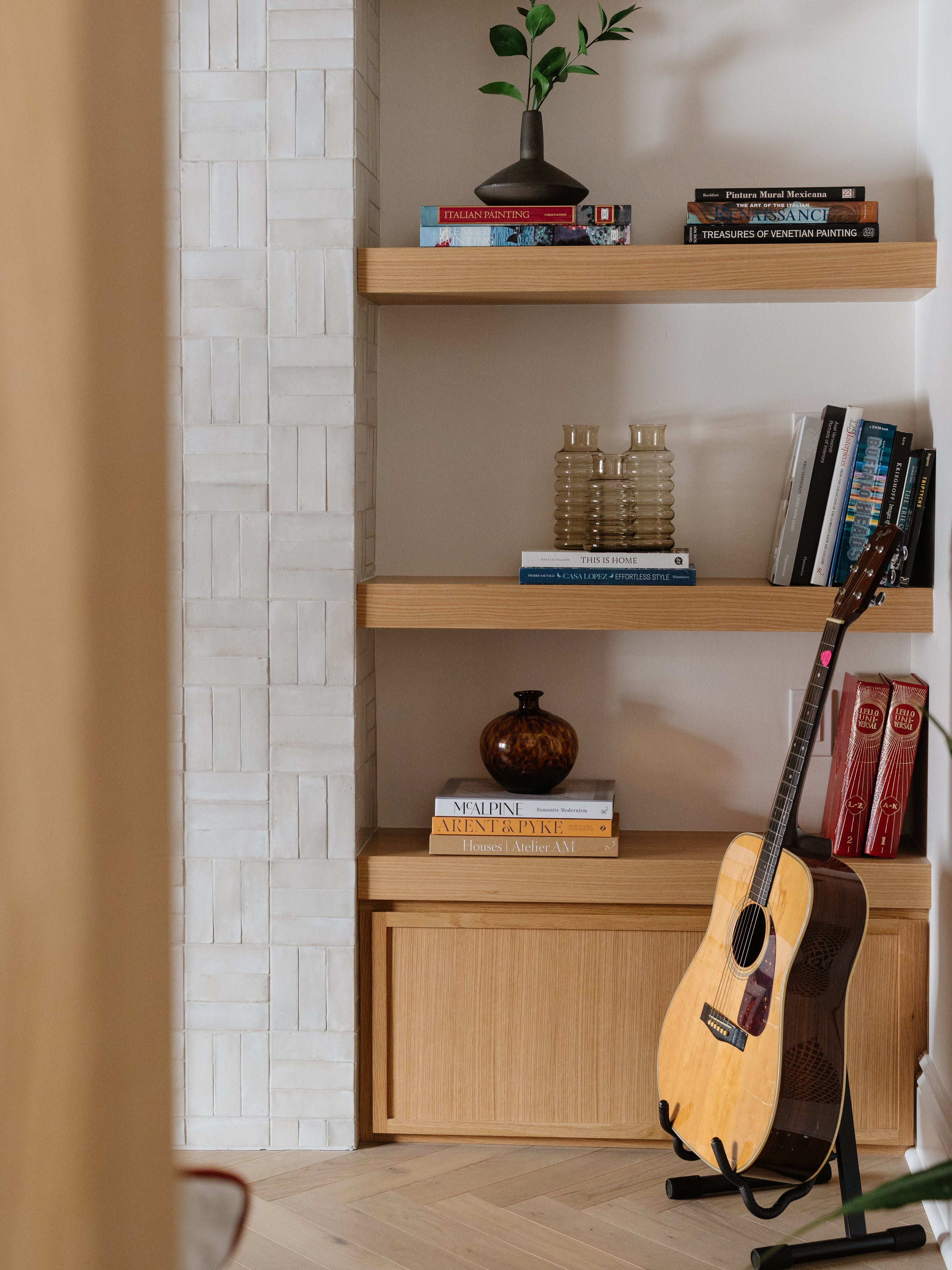
The staircase underwent a complete transformation, becoming a stunning focal point visible from all angles. We added custom millwork throughout the space to ensure ample storage for the family’s current and future needs.
Bringing It All Together
The Corso Italia project was a labor of love, blending practicality with artistic touches. From the redesigned kitchen to the revamped staircase, every detail was carefully considered to create a space that not only looked beautiful but also worked seamlessly for Shanna and Kevin's family.
Take a look at the photos to see the incredible transformation for yourself. We'd love to hear your thoughts on this project and how it has inspired you to rethink your own living space. Share your comments and let us know what you think!

